A Likert scale is a rating scale used in surveys that gauges the intensity of respondents’ feelings by asking them to rate their agreement with a set of statements.
In this blog, we explore the benefits and applications of Likert scales and how to use them in your surveys.
What is a Likert scale?
Likert scales, commonly recognised as the “strongly agree” to “strongly disagree” scales in surveys, are often used to measure qualitative data, descriptive information that provides insights into people’s experiences, behaviours, and perceptions.
Developed by Rensis Likert in 1932 for his PhD thesis, A Technique for the Measurement of Attitudes, the Likert scale was designed to assess attitudes and opinions. These scales typically offer a range of responses, most often featuring either 5 or 7 options.
Advantages of using Likert scales
Likert scales are useful in surveys for many reasons – we’ve highlighted some key benefits below.
Collecting qualitative data
By assigning numerical values to responses, Likert scales allow for statistical analysis. This data can be visualised through stacked agreement charts and interquartile ranges, showing the spread of responses across the entire sample. Mean scores also provide statistical insight into general respondent opinions.
Measuring degrees of opinion
Unlike simple yes/no questions, Likert scales capture the intensity of respondents’ feelings, offering more nuanced insights into their attitudes toward a statement or topic.
Reaching a wider audience
Likert scales are user-friendly and widely understood, which increases response rates. Their simple format can also be adapted with emojis to engage different demographics or age groups. For more information on using emoji’s in your surveys, click here.
Facilitating comparisons
The numerical scores from Likert scales enable comparisons across different groups, conditions, or time points, providing valuable insights into trends and changes over time.
Designing Likert scale questions
We have provided some helpful tips on developing your own Likert scale questions to ensure consistent collection:
- Be clear and precise in your wording. Avoid confusing language that could be misinterpreted such as double negatives, leading questions that are biased towards a particular answer, double-barrelled questions that ask about multiple things or vague questions that are too broad.
| Example | Do ✅ | Avoid ❌ |
|---|---|---|
| Double negative | Perth is an enjoyable place to live | Do you not agree that Perth isn’t an enjoyable place to live |
| Leading question | I would come to something like this again | This event was so much fun you would come again |
| Double-barrelled | – There are lots of fun things to do in Perth – Perth is a great place to live | There are lots of fun things to do in Perth and it is a great place to live |
| Vague | The event was well produced and presented | It was good |
- Be consistent in wording and structure, both within the survey and across multiple surveys. This avoids confusion and allows for greater analysis and benchmarking.
- Consider your audience and how you would like to use the data so that you can pick an appropriate scale.
- Ensure response options cover the full range of possible attitudes or opinions.
Visualising Likert scale data
We’ve provided some common examples on how you can visualise Likert scales data from the Culture Counts Analytics Dashboard.
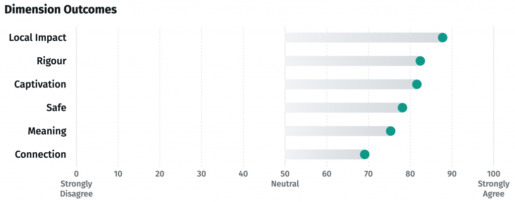
Average-mean chart
An average (mean) chart displays the average score of all responses. This chart is useful for summarising overall sentiment or opinion.

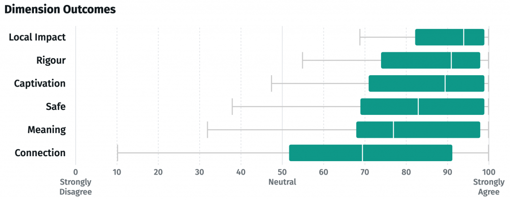
Interquartile range and median chart
This chart visualises the distribution of responses by showing the interquartile range (IQR) and the median. The median represents the middle value of the dataset (the point at which half the responses fall above and half fall below), while the IQR shows the range within which the middle 50% of responses lie. The interquartile range and median chart is ideal for understanding the spread of responses and identifying any potential skews in the data.

Stacked level of agreement chart
This chart displays stacked bars that indicate the percentage of respondents that selected each level of agreement. This chart is excellent for visualising the overall distribution of responses.

How Culture Counts uses Likert scales
Likert scales can be a valuable tool for quantifying qualitative data, like outcomes – how people have changed after an activation or event. This understanding helps us to tell the story or people or the broader society, as as result of this change (impact).
Culture Counts has developed a set of standardised questions using the Likert sacle, known as dimensions, which align with specific outcome areas. By consistently measuring responses to these sliding scale questions, we generate data that is both comparable and benchmarkable.
Extensive research and academic validation has taken place to ensure our dimension statements are accessible and encompass a range of outcome areas. For more information on our outcomes framework, click here. Are you interested in finding out more? Book an appointment with our friendly Client Management team.


